How do you build a successful lead generation recruiter website?
It’s a question we’ve asked and answered on this blog before but we realized that it’s a topic too complex to tackle in a single blog post.
With that in mind, we’re launching a new series – the Recruiter Website Breakdown. In this ongoing series, we will choose a recruiter website at random and break it down, showcasing the highlights and lowlights.
Without further ado, let’s dive right in. This week, we are going to tackle Reaction Search, an executive search and sales recruiting firm with offices across the US and the world.
Highlights
1. Industry and geography specific pages
If you want to give you recruiter website a chance to show up in search for niche queries (think “chicago recruiter IT” or “los angeles recruiting firm retail”), you need to have a page on your site for every industry and geography that you are targeting. Reaction Search does this well as they not only have a page for every industry and location but they also have a page for every industry-location combination (e.g., Edison, NJ – Accounting). For a company of this size, it must have been a difficult task as it is tough to create original content for each page.
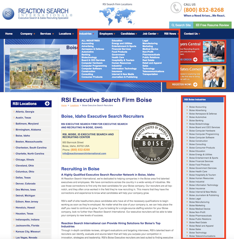
In many cases, as you can see in the image below, Reaction Search does a good job at creating content that is original but with the side effect that it is created exclusively for search engines and has no value to a real person reading the page.
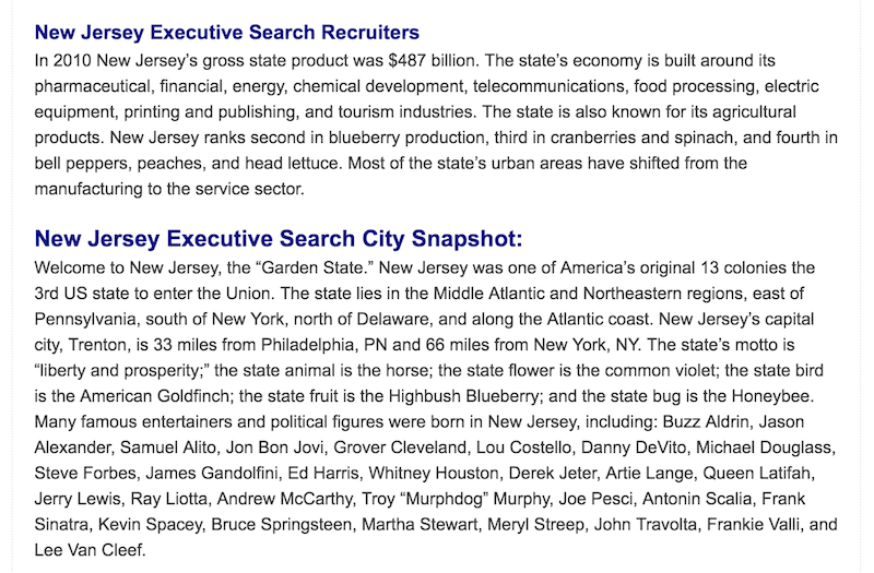
Would you want to read this drivel?
In some cases, they have not executed their content strategy properly, an example of which you can find in the Lowlights section below.
2. Permanent job postings
Every good recruiter website needs a job board. However, from an SEO perspective, a job board can be tricky since job postings are not permanent content. In other words, when you post a job for a brief period of time (when the position is open), Google will not rank that page and drive traffic to your job posting because it is temporary.
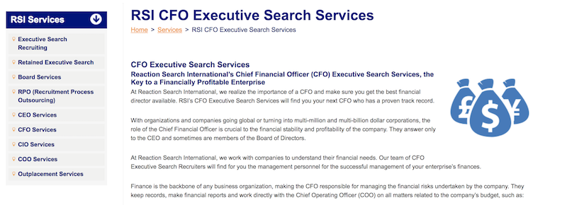
To get around this problem, your site needs to have permanent job postings. A permanent job posting can come in two forms. First, it can look like a regular job posting but have no expiry date. The problem with this approach is that if someone applies to the job and you don’t actually have a position to fill, you will be left looking a bit foolish. Second, you can have a page for each of type of job that you typically fill. This is what Reaction Search has done.
If you look below, you’ll find an example of a page specifically targeting people who are looking to hire a CFO through an executive search process. This type of page has a chance to show up in search results and provide SEO benefit to the firm.
3. Case studies
Case studies are useful for two reasons.
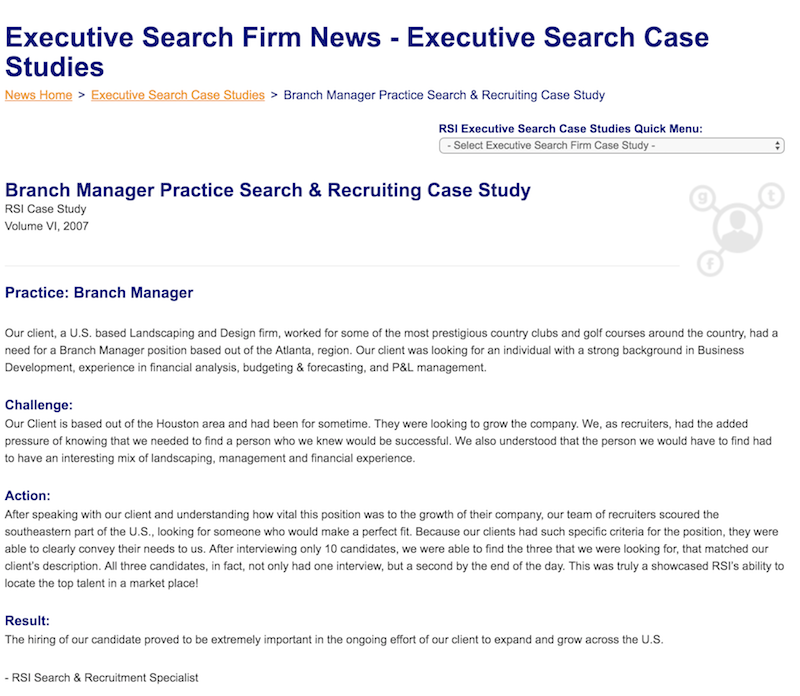
First, they can be used to rank your recruiter website for niche job postings. In this case, if I wanted to rank for the search term “branch manager recruiter”, I would write a case study much like this one.
Second, they outline how you deliver value to your client. In this particular case study, Reaction Search is a bit lacking. The case study does not offer enough detail for the reader to be engaged by the story. Furthermore, it is 10 years old even though it is the first case study listed on the site, a sign that this portion of the site has been abandoned.
Lowlights
1. Duplicate content
If you’re going to execute a strategy of creating a page for every industry and geography that you target, you’ll need to generate a lot of content. This process can be time-consuming and there’s a tendency to cut corners by duplicating content. This is a bad idea if you’re trying to rank your page for search as Google tends to penalize sites that duplicate content.
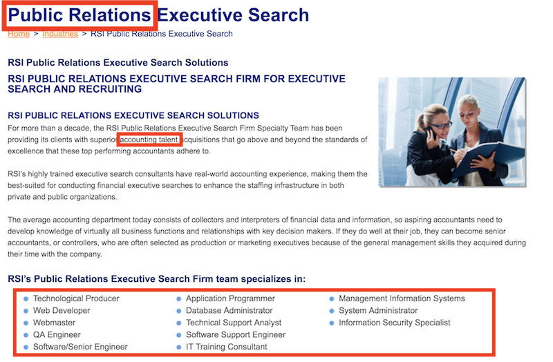
Even worse, you might end up with a situation like this where your page on public relations recruiting talks about accounting talent and has a list of tech jobs. Looks like someone dropped the ball.
2. Employer Central
Whenever we discuss an optimized website, we emphasize that you need to have clear calls-to-action (CTA) on every page to encourage the site visitor to take a specific action.
Sometimes, your CTAs can be a bit aggressive.

In this example, Reaction Search asks employers to visit their Employer Central page. The content of this page could vary depend on how your site is structured but it certainly doesn’t make sense to have it contain only a form asking for a job order.
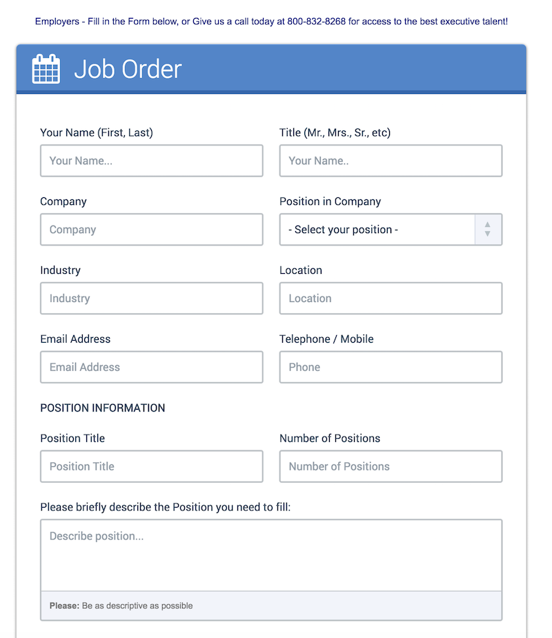
While it would be nice to get a job order this easily, especially for a high profile executive search, it seems unlikely that anyone would fill out a form at this stage in their buyer journey. Before you make a large ask like asking someone to fill out a form that begins a sales process, you need to warm them up quite a bit more.
3. Useless banner image
There are ample statistics showing why sliders such as the one on this home page should not be used . They are especially bad when they use cheesy stock photography, have no left/right controls, contain 13(!) images, don’t pause when you are hovering your mouse over them and don’t link to anywhere else on the site. It’s tough to commit this many web design faux pas in one spot.

Instead of a slider, consider a single high-quality banner image with a clear call-to-action or statement of your company’s mission statement. By developing your home page like this, you ensure that every user sees the most important message you want to emphasize.

